Chat input - Usage
In chat inputs, users write and send messages. We recommend using them for quick, iterative exchanges, not for multi-step data entries.
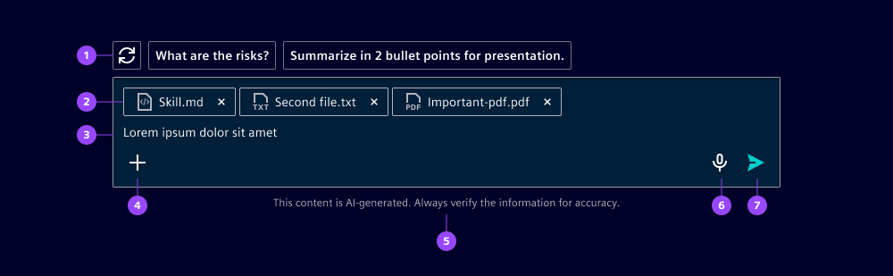
- Follow-up prompts
- Attachments
- Textarea
- Start slot for secondary actions
- Disclaimer
- End slot for alternative input methods
- Send button
Options
- Placeholder: Use clear, contextual prompts, e.g. “Enter a command, question or topic…” (see writing guidelines).
- Follow-up slot: Optionally include a slot for follow-up questions. We typically use tertiary outline buttons or icon buttons for that purpose.
- Attachment slot: Optionally include a slot for attachments.
- Start slot: Add secondary actions. We recommend using tertiary outline icon buttons and trying to stick to one action. If you have more than one action, use dropdown buttons.
- End slot: Use this slot to add alternative input methods, e.g. voice input.
- Disclaimer: In AI contexts, we recommend including a visible disclaimer under the input instead of under each AI message. For Siemens AG products, find legal disclaimers here.
- Character limit: Set soft and hard character limits that either warn users or prevent further input.
Behavior in context
- Interaction: Keep the input compact at start and let it grow to multiline while users type
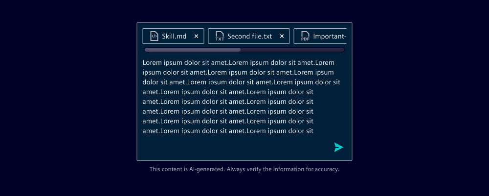
- Overflow:
- On the follow-up actions: If the actions exceed max width, they break into multiple lines
- On the input: If the input reaches max height, the input shows a vertical scroll
- On the attachments: If the attachments reach max width, they show a horizontal scroll
States
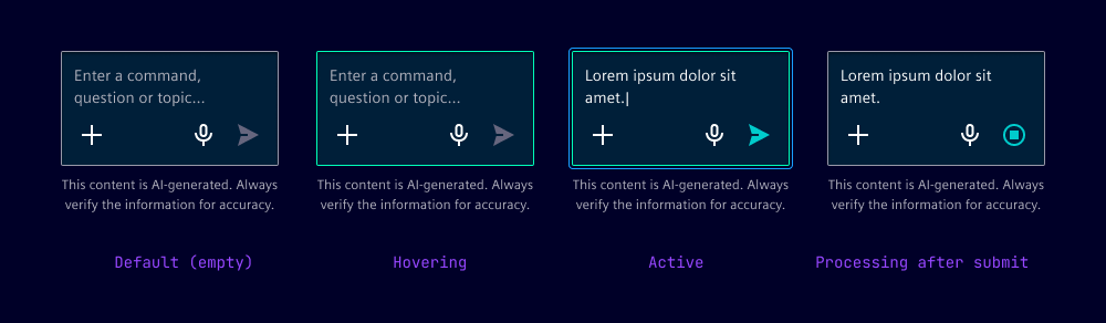
Chat inputs have four states: default, hover, focused and processing.
Dos and Don’ts
- Do keep action labels verb-based and specific so users understand the outcome (see guidelines for Siemens AG employees)
- Don’t allow users to send empty input
- Don’t rely on color alone to communicate validation errors
- Don’t place AI disclaimers away from user input and messages