overview
Our commitment as a design system
We are committed that our deliverables qualify for building solutions that are accessible for everyone. We strive to meet WCAG AA standards by providing perceivable, operable and understandable components.
Ensuring accessibility in products
While our components are designed to meet accessibility standards, it is essential to remember that the overall accessibility of your solutions depends on how these components are used.
Simply incorporating our accessible components does not guarantee that the final product will be fully accessible. It is the responsibility of the developers and designers to ensure that their implementations adhere to accessibility best practices throughout the entire design and development process.
A comprehensible quick reference on how to meet Web Content Accessibility Guidelines can be found here.
WCAG and the key principles
Web Content Accessibility Guidelines (WCAG) explains how to make web content more accessible to people with disabilities. WCAG covers web sites, applications, and other digital content. It is developed by the World Wide Web Consortium (W3C) Web Accessibility Initiative (WAI). WCAG is an international standard.
The four main guiding principles of accessibility within WCAG are perceivable, operable, understandable, and robust. These overarching principles contain clear guidelines for creating and presenting WCAG-compliant digital content.
There are three levels of conformance:
- Level A is the minimum level.
- Level AA includes all Level A and AA requirements. We strive to meet Level AA.
- Level AAA includes all Level A, AA, and AAA requirements.
https://www.w3.org/WAI/fundamentals/accessibility-intro/
Principle 1: Perceivable
Information and user interface components must be presentable to users in ways they can perceive.
Provide text alternatives
Provide text alternatives for non-text content. It allows content to be adapted into formats that support assistive technology e.g. screen readers (WCAG reference 1.1).
- Provide text alternatives for any non-text content, such as icons without text labels
- Annotate your designs to provide text alternatives when developing
- Provide text content for videos
- Provide captions for figures and tables
- Avoid images containing text
Example: Use ARIA tags to ensure that your content is accessible and understandable to all users, including those using assistive technologies.
| ARIA tag | Description |
|---|---|
aria-label | Provides an accessible name for an element. |
aria-labelledby | Identifies one or more elements that provide the accessible name for an element. It is often used when the label is already present on the page. |
aria-describedby | Identifies the element that provides a description for the element it is applied to. |
Create adaptable content
Design and implement content that can be presented in various ways, such as a simpler layout, without losing information or structure. This flexibility allows users to access and understand content regardless of their specific needs or the devices they are using (WCAG reference 1.3).
- Ensure information is available in text or can be programmatically determined
- Allow both landscape and portrait orientations
- Provide tooltips for data cells to show context in tables
- Designate regions like header, main and footer
- Provide related inputs as form
- Annotate reading order
Example: Input components include optional attributes for label, required indicator, and helper or feedback text, and are usable inside a form.
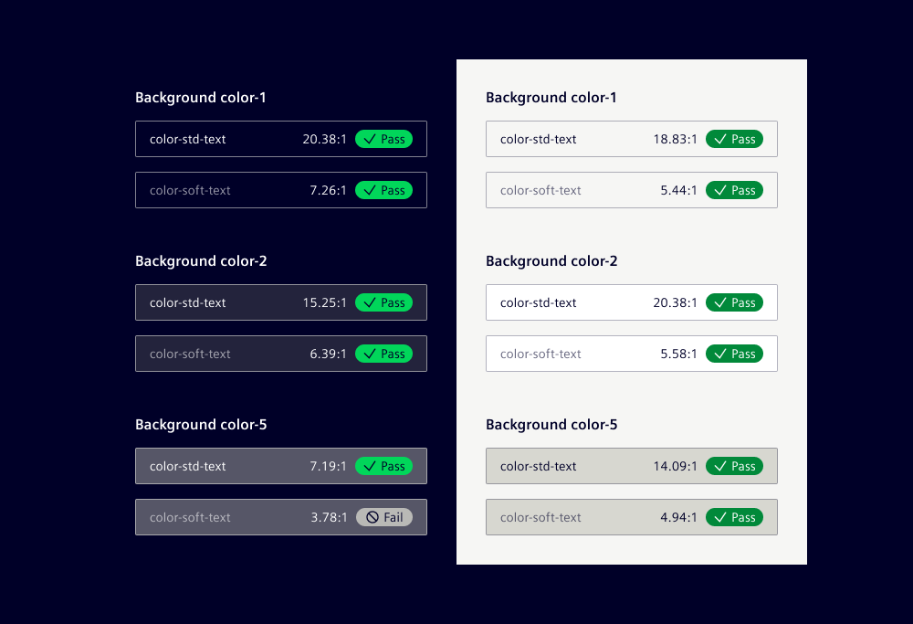
Combine color and contrast
In industrial software applications, color significantly enhances the visual communication of information. Nonetheless, it is essential to account for users with limited vision or color blindness. Use color combinations (WCAG reference 1.4) that meet accessibility standards for contrast to make it easier for users to see content, including separating foreground from background.
Use text on background
- Ensure minimum contrast for body text is 4.5:1
- Ensure minimum contrast for large text is 3:1
- Ensure icons meet 3:1 contrast with the background
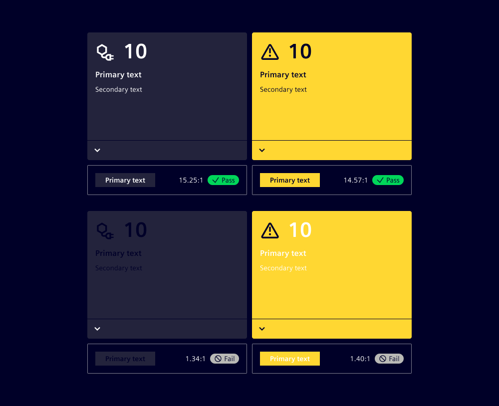
Example: On background colors 1 to 4, both text colors (std-text and soft-text) pass the WCAG AA criteria for body text, large text, and icons.
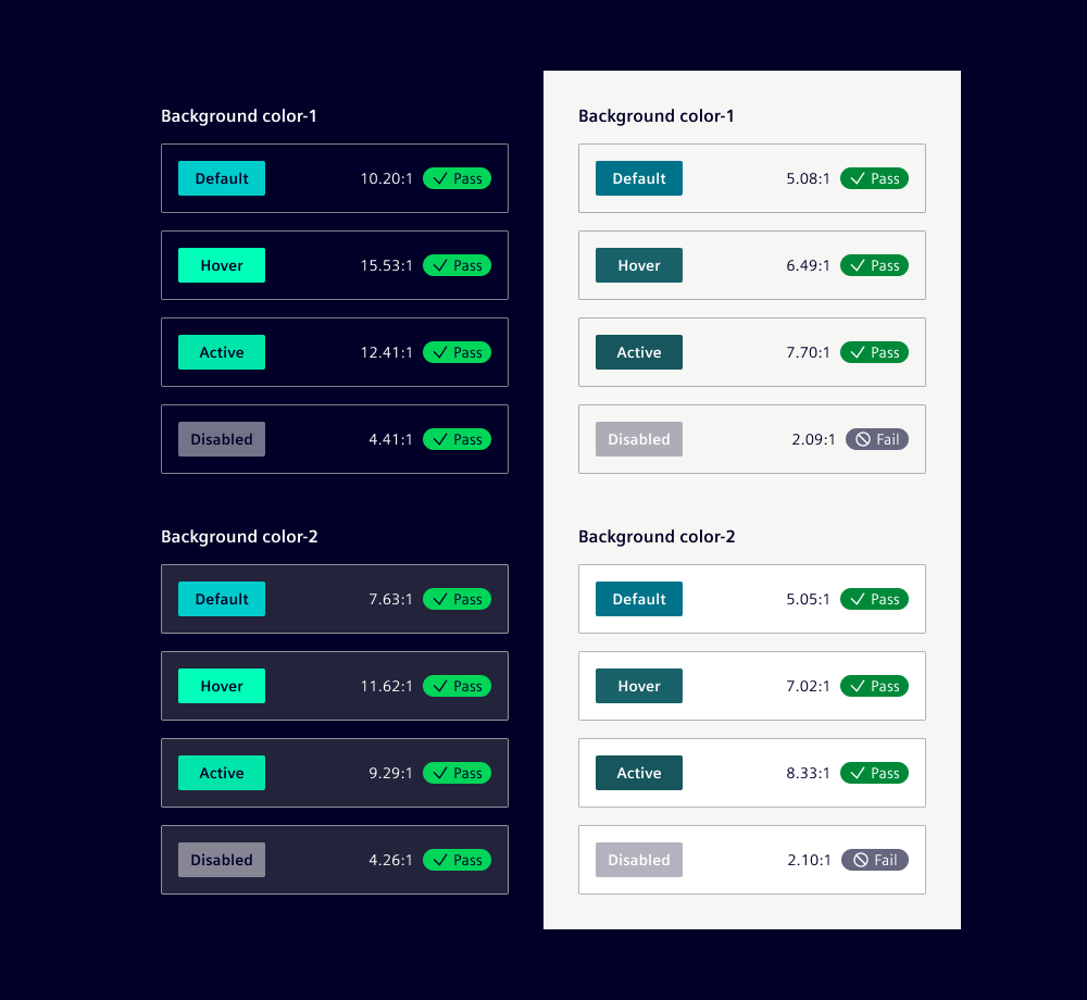
Contrast components
While the components in our design system are built to meet baseline contrast requirements, it’s essential to evaluate contrast in the context of their implementation such as background colors or surrounding element.
- Ensure component contrast for adjoining colors is 3:1
- Ensure visual states for components meet 3:1 contrast with adjoining colors
- Ensure data visualization meets 3:1 contrast with the background
Example: On background colors 1 to 4, primary buttons pass the WCAG AA criteria for default, hover, and active states. For disabled states, the criteria do not apply as inactive components are exempt.
Example: In the push card component, we adjust the font color based on the card's status color to ensure sufficient contrast.
Use more than color
- Ensure information conveyed by color is available in text as well
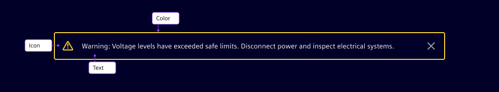
Example: The message bar component uses color and an icon to indicate the severity level. To be compliant with WCAG, the text matches the severity level and is understandable without the color or the icon.
Principle 2: Operable
User interface components and navigation must be operable.
Provide keyboard usage
Every feature in your industrial software needs to be operable via a keyboard (WCAG reference 2.1). This approach supports users who prefer or need to use keyboard controls, and cannot rely on mouse or touch.
- Annotate tab order
- Annotate keyboard interaction
- Ensure all components are operable by keyboard
- Follow ARIA keyboard guidance for custom components (ARIA reference)
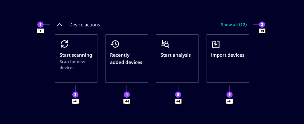
Example: Annotate tab order to allow the navigation of interactive elements by pressing the Tab key. The standard behavior follows the reading order from left to right and top to bottom.
Example: Note that disabled elements are non-interactive, do not display tooltips, and are ignored by assistive technologies like screen readers.
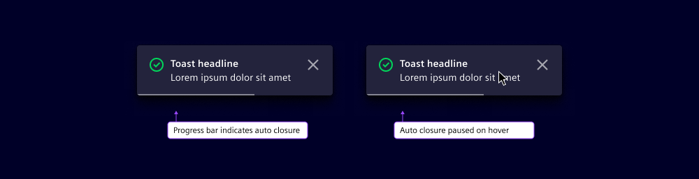
Give enough time
Ensure that users have sufficient time to read and interact with the content in your applications. This consideration is crucial for users working in dynamic environments where interruptions are common (WCAG reference 2.2).
- Avoid autoplay content
- Avoid time limits or allow adjustment
Example: Dismissible message bars stay visible until users close them. This avoids time pressure and gives users enough time to read and act on important information.
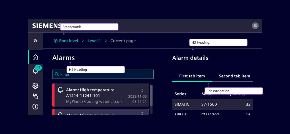
Implement navigable aids
Navigation aids help users find content and understand their location within your applications (WCAG reference 2.4). This includes features like breadcrumbs, search functionality, and clear labeling to enhance user experience and efficiency.
- Use headings properly (
<h1>...<h6>) - Provide descriptive page titles
- Provide clear link text
- Provide links to skip blocks
- Provide a search function
- Reduce the use of text styles and decorations
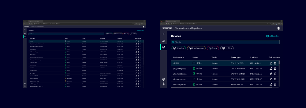
Example: Here we have detailed navigation using a breadcrumb, hierarchy of headings and tab navigation within details.
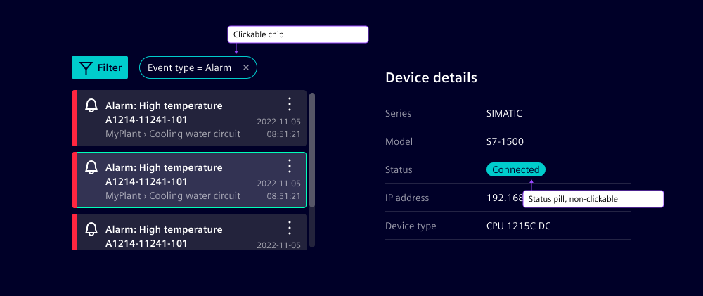
Customize input modalities
Enhance the usability of your applications by making it easier for users to operate functionality through various input methods. This includes supporting keyboard, mouse, touch, and voice inputs to accommodate different user preferences and working conditions (WCAG reference 2.5).
- Allow for simple pointer actions for all interactions
- Ensure minimum target size of 24x24 pixels
- Provide alternatives to device motion responses
- Allow cancel, undo and reverse for pointer actions
Example: The chip component, which is clickable, has a minimum height of 32px to ensure it meets accessibility requirements for touch targets. The pill component, being non-interactive and used only for displaying status, can have a smaller height.
Principle 3: Understandable
Information and the operation of the user interface must be understandable.
Ensure readability and comprehension
Make text content easy to read and understand. Implement straightforward language, legible typography, and organized layout to improve user experience and accessibility (WCAG reference 3.1).
- Specify the default language of the page in HTML
- Use simple, clear language
- Provide definitions for complex terms
Tip: Our writing guidelines help make applications readable and understandable.
Be predictable
Create consistent and intuitive applications that behave as users expect. Ensure navigation and interactions follow established patterns, helping users to interact with your application without unexpected behavior (WCAG reference 3.2).
- Provide clear error messages and correction options
- Provide help mechanisms in the same location
- Use the same icons for identical functions
- Ensure predictable patterns on input and focus
- Keep button styles consistent
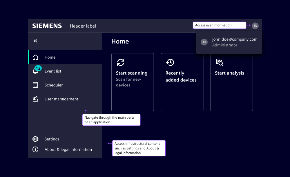
Example: Using the application frame ensures that the main navigation is always in the same location.
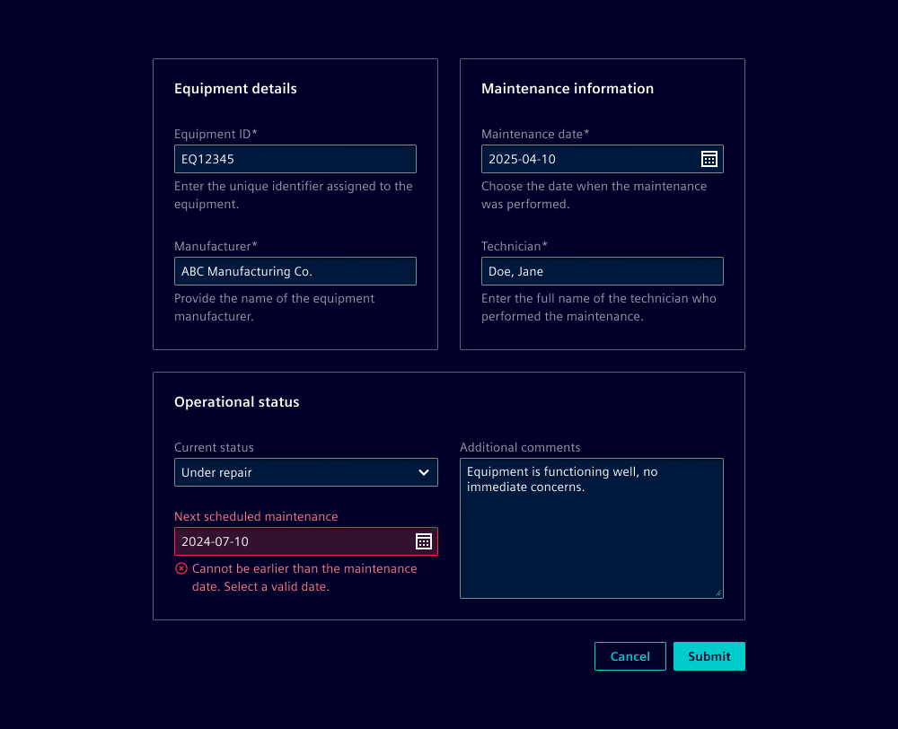
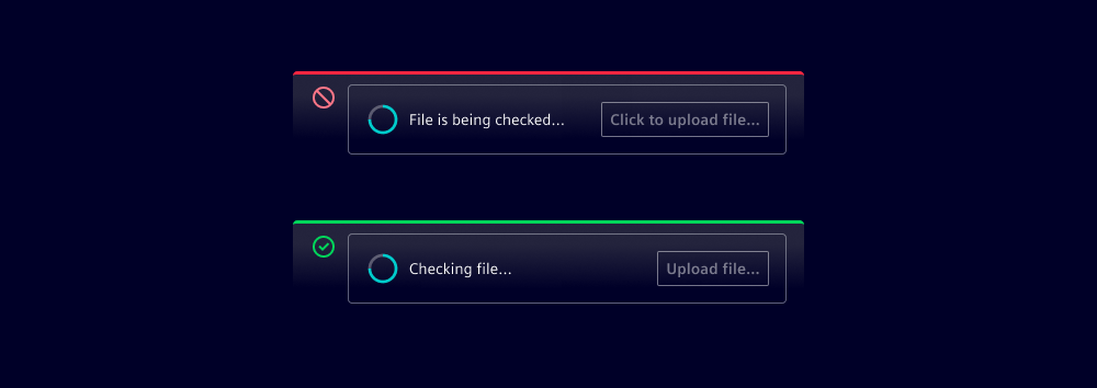
Give input assistance
Actively assist users in avoiding errors through preventive design and helpful guidance. When mistakes do occur, provide clear, constructive feedback and simple correction options to help users recover and complete their tasks successfully (WCAG reference 3.3).
- Provide labels for inputs
- Indicate required fields and provide legends
- Provide expected data formats
- Avoid validation before user exits focus
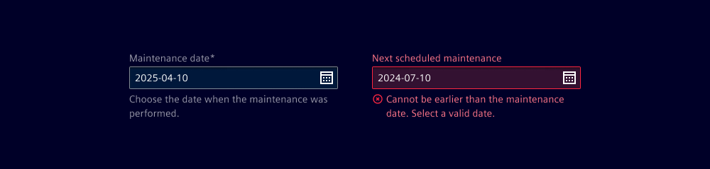
- Describe errors
- Provide reverse and undo
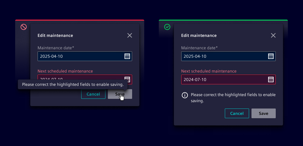
Example: Errors are described using the feedback text of input components.
Principle 4: Robust
Content must be robust enough that it can be interpreted by a wide variety of user agents,including assistive technologies.
Build your application with clean, standards-compliant code that ensures compatibility with browsers, devices and assistive technologies (WCAG reference 4.1).
- Use proper ARIA labels and roles
- Make status messages programmatically available
- Test with multiple browsers and versions
- Test with assistive technologies
- Test with different zoom levels
Example: Test whether content is readable and functional when zooming in to at least 200%, ensuring users with visual impairments can effectively use your application.