Toggle button - Usage
Toggle buttons with and without text labels are available. We typically use toggle buttons to switch between states or modes. They are ideal for scenarios where a setting can be turned on or off, or where a selection can be toggled independently of others.
Variants, options and states of the button and the icon button components apply. Only additional, deviating or detailing specifications are listed here.
Options
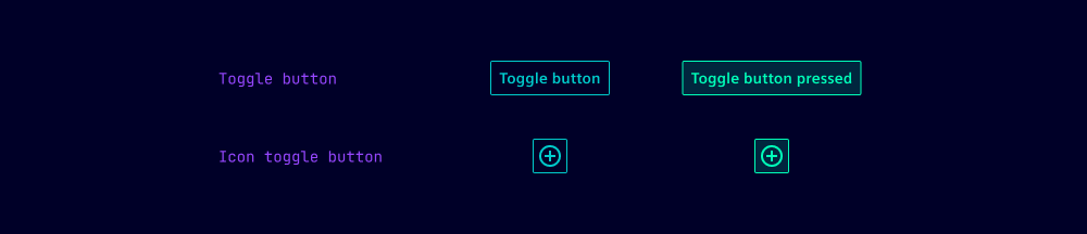
- Pressed: Toggle buttons can take a pressed (active) state. To improve accessibility, this state is set via the pressed option so it can be read by screen readers.
- The options type and color are not available for toggle buttons.
- For the default variant, one of the options secondary or tertiary has to be set.
- Oval: The shape of icon toggle buttons can be adjusted from square to oval.
Behavior in context
- Independent toggling: Toggle buttons are typically used on their own or in layouts where each button represents an independent setting or mode. For example, toggling bold, italic or underline in a text editor.
States
Toggle buttons have five states: Default, hover, active, disabled, loading and focused. All states are also available for pressed toggled buttons.
Dos and Don’ts
- Do use toggle buttons when users can switch a setting on or off independently
- Do use toggle buttons when two opposing options don’t follow the on/off metaphor
- Don’t use toggle buttons in button groups where only one option can be selected (use normal buttons or icon buttons instead)