Button - Usage
Buttons initiate actions, apply actions to selected objects and activate/deactivate functions. We typically use buttons to trigger an immediate action, and you can place them within dialogs, forms, modal windows and other containers.

- Label
- Icon
- Icon right
Variants

-
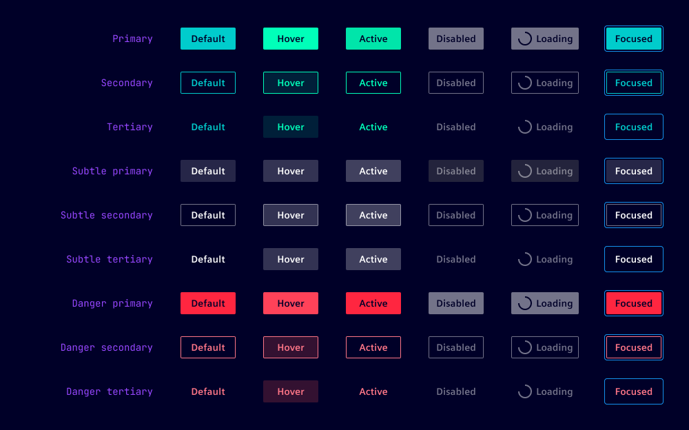
Primary: Use for primary actions, e.g. "Confirm" or "Send".
-
Secondary: Use for secondary actions supporting the primary action, e.g. "Cancel" or "Reset".
-
Tertiary: Use for tertiary actions that serve specialized or conditional purposes, e.g. "Advanced settings", "More options", "Help" or "Customize", "Change preferences" or "View details".
-
Subtle variants: Use as an alternative when a softer visual preference is required. When using the subtle primary button for the primary action, ensure that subtle secondary and subtle tertiary buttons are used for supporting and contextual actions respectively.
-
Danger variants: Use for destructive or critical actions like "delete" or "remove". We typically use the danger button for actions that are irreversible or have a significant impact on the user’s data or the application state.
Options
- Label: Displays short, descriptive text that clearly communicates the action triggered by the button.
- Icon: Appears left of the label and supports the label visually. This is the preferred position. Use icons that are widely recognized by users for the intended action. See icon button for buttons without label with icon only. In loading state, this icon is replaced by a loading spinner.
- Icon right: Appears to the right of the label. Use this position as placing the icon on the left is counterintuitive, such as a “Next” button with a right-pointing arrow in wizard-like modals.
- Type: Use
submitwhen sending user input from a form to a server. For all other actions such as triggering dialogs or performing navigation use the default typebutton.
Behavior in context
- Interaction: Buttons can be triggered by pressing anywhere within the button container. When buttons are focused, they can be triggered by pressing
Space. - Text truncation: Button labels are not truncated. All text on buttons is one line only.
- Alignment: Buttons can be left or right-aligned or fully span a container’s width.
- Button width: Buttons dynamically adjust their width based on content, but have a default minimum width of
5remto ensure harmonious alignment for common pairs like "OK" and "Cancel". The minimum width can be customized for different needs. - Cluster buttons: Cluster buttons in groups with related functions. A cluster might include various types of buttons, e.g. primary, secondary and tertiary. We recommend a gap of
0.5rembetween buttons.

States
Buttons have six states: Default, hover, active, disabled, loading and focused. In a disabled and loading state, buttons are visually displayed but never offer any user interaction.
Dos and Don’ts
- Do use short button labels to allow users to quickly scan, understand and remember them (see our writing style guide)
- Do use ellipsis (…) to indicate that an action requires further input or choice from the user, e.g. "Save as…" which opens a list of file types to choose from
- Do use the primary variant for buttons to indicate one primary action in a visual unit, all other secondary actions should use the secondary variant
- Don’t place icons both left and right of the label on the same button
- Don’t use the danger button excessively or repetitively in lists or tables
- Don’t rely on standard buttons when many actions are necessary (use dropdown buttons or split buttons instead, or move some functionality to a pane or a dialog)