Data Grid (AG Grid) - Usage
AG Grid displays large datasets with advanced interactive features such as sorting, filtering, and row selection. Use it when you need to present tabular data with complex interactions and rich customization options.
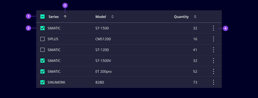
- Header
- Row with checkbox selection
- Column sorting
- Row context menu
Options
Only a subset of the most commonly used options and features are listed here. For a complete set of available options and configuration, please refer to the official AG Grid documentation.
- Filtering: Column-level filters with operators (equals, contains, range). Support AND/OR combinations.
- Rows:
- Alternate row styling: Use striped rows to improve readability. We typically use it for datasets with many columns to help users track across rows.
- Grouping: Group rows by selected criteria. Grouped sections collapse and expand via interactive controls.
- Selection: Enable row selection via checkboxes. Selection is independent of row clicks.
- Detail view: Open modals or panes via row click or context menu.
- Columns:
- Sorting: Support single or multi-column sorting. Supports ascending and descending for all data types.
- Visibility and reordering: Enable to show or hide columns, or to reorder columns via drag-and-drop.
- Cells:
- Inline editing: Enable cell editing directly in the grid for single or multiple records.
Behavior in context
- Interaction:
- Column header: Click column header to sort. Show active sort indicators. Support multi-column sorting with Ctrl/Cmd+click.
- Selection: Click row checkbox to select. Header checkbox selects/deselects all visible rows. Row clicks open detail view without affecting selection.
- Row selection and actions: Users select rows via independent checkboxes (with a header checkbox for all visible rows), access actions via context menu.
- Overflow: By default, if the total width of columns exceeds the grid width, horizontal scrolling is enabled.
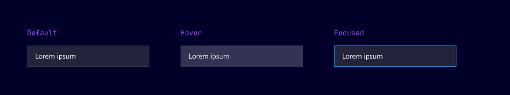
States
Data grid columns, rows and cells have multiple states: Default, hover, active and focused.
Dos and Don’ts
- Do only display primary information by default and use column tool panels for secondary information
- Do keep selection and row-click behavior independent to avoid confusion
- Do design responsive layouts that adapt to different screen sizes
- Don’t embed heavily interactive components within grid cells
- Don’t rely solely on color for status, use icons, labels or badges instead