Input - Usage
Input fields are commonly used in forms, search bars and other areas where data input is required.

- Label
- Required indicator
- Placeholder
- Slot-end
- Slot-start
- Container
- Helper or feedback text
- Counter
Options
- Label: See form field.
- Slot options: Add optional elements at the end and/or start of the input field, e.g. an icon, a button or a text option. We typically use slots for additional indications, options or information like a visibility toggle in a password field.
- Placeholder: Use a placeholder to provide a hint about what to enter or additional relevant context while the input field is empty. We typically use a placeholder when the label is not visible or we need to provide additional context.
- Helper text: See form field.
- Counter: See form field.
- Feedback text: See form field.
Behavior in context
- Validation: See validation.
- Interaction: Clicking in the container enables the editing of the field.
- Text truncation: The text in an input field is cut off with the length of the container.
- Alignment: Inputs are always aligned to the left, while right alignment is reserved exclusively for number fields.
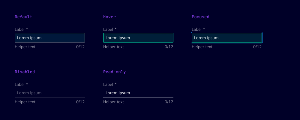
States
The input field has five states: default, focused, hover, disabled and read-only. In the read-only state, the input field is displayed without offering any user interaction.
Dos and Don’ts
- Do use helper text to guide users through the input process
- Do use feedback text to inform users about the status of their input
- Do ensure that the width of the input field is appropriate for the expected content
- Don’t overcrowd the input field with too many elements
- Don’t use placeholders as a substitute for labels