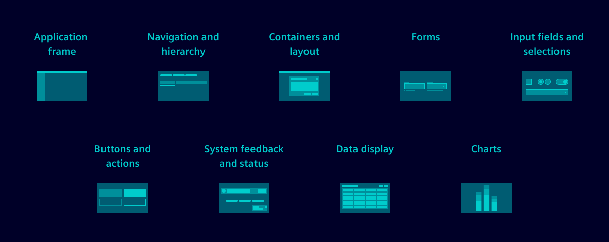
Application frame
| Component | Description |
|---|---|
| Application | Applications manage the layout and theming of top-level app elements, ensuring a cohesive user experience. |
| Application header | Application headers provide a structured area for key elements like brand logo, application name and user avatar. |
| Application menu | The navigation menu provides direct access to main application parts, legal and version information, and settings. |
| Avatar | Avatars visually or textually represent individual identities, typically for users logged into a system. |
| Content | The content component is a simple layout component made for hosting content. |
| About and legal | The About and legal component is an overlay we typically use to show application information, application versions, license terms, legal regulations, copyright information and other legal content. |
| Settings | The settings overlay provides a centralized location for application settings. |
Navigation and hierarchy
| Component | Description |
|---|---|
| Breadcrumb | Breadcrumbs provide a clear navigation path within an application. |
| Group | Groups are expandable containers for a list of selectable options. |
| Pagination | Paginations allow users to navigate between pages of content when it is split for performance reasons. |
| Tabs | Tabs consist of tab items and organize content into separate sections by grouping similar information. |
| Tree | Trees display hierarchical data structures and allow users to navigate by expanding and collapsing nodes. |
| Workflow | Workflows are a series of logical steps that guide users through a process. |
Containers and layout
| Component | Description |
|---|---|
| Blind | Blinds enhance content organization by allowing users to toggle visibility through collapsing and expanding sections. |
| Card | Cards neatly organize and group related information about a specific subject. |
| Card list | Card lists display a large number of cards or items of the same type in a lightweight, grouped manner. |
| Flip | Flips are containers that flip when clicked to reveal additional content. |
| Event list | Event lists display a list of any type of element with additional details. |
| Drawer | Drawers are containers that open on the click of a button to show additional content. |
| Layout auto | Auto-layouts are containers that automatically adjust the size of their columns based on the content. |
| Layout grid | Layout grids are used to structure the layout of a page or screen responsively. |
| Modal | Modals present information prominently and are useful for gathering essential user input without navigating to another page. |
| Panes | Panes are interactive components that allow users to access content that isn't constantly visible on the screen. |
| Tile | Tiles are containers that display content in a card-like format. |
Forms
| Component | Description |
|---|---|
| Forms field | A field is a form element when user input is needed. It's typically used with other form elements in a fieldset. |
| Forms layout | Effective form layouts play a crucial role in usability. Well-structured forms include fieldsets, considering the hierarchy of information, and understanding how to strike the right balance between aesthetics and functionality. |
| Forms validation | Form validation gives users feedback on their input to ensure accurate, consistent data is submitted. When requirements are not met or data is incorrect, it’s rejected. |
| Forms behavior | Forms behavior refers to the way in which user input is handled and validated within a form. It plays a crucial role in providing a seamless and user-friendly experience for form interactions. |
Input fields and selections
| Component | Description |
|---|---|
| Category filter | Category filters allow users to quickly narrow their search by selecting predefined categories. |
| Checkbox | Checkboxes are form controls that allow users to select none, one or more options. |
| Custom field | Custom fields are wrapper components that can host any form component. |
| Date dropdown | Date dropdowns allow users to select a specific date from a date picker or pre-defined date options. |
| Date input | Date inputs allow users to enter and select dates in a standardized format, ensuring consistency and accuracy. |
| Date picker | Date pickers provide a versatile calendar that can be used as a standalone element or within a dropdown for date input, offering a seamless way to select dates. |
| Date time picker | Date-time pickers offer an interface for selecting both dates and times, which can be used as a standalone element or within a dropdown, providing a seamless way to input date and time values. |
| Expanding search | Expanding searches are search fields that expand on click to save space. |
| Number input | Number inputs allow users to enter and adjust numerical values. |
| Radio | Radio buttons enable users to choose only one option from a predefined set of mutually exclusive options. |
| Select | Selects allow users to choose from a list of options. |
| Slider | Sliders allow users to select a value from a range of values. |
| Input | Input fields allow users to enter and edit single-line text, numbers, and other character-based symbols within an application. |
| Textarea | Textareas allow users to enter and edit multi-line text input, making it perfect for forms that require longer entries. |
| Time picker | Time pickers allow users to select specific times ensuring accurate time input. |
| Toggle | Toggle switches enable users to toggle between an on and off state. |
| Upload | Uploads allow users to select and upload files from their device via drag-and-drop. |
Buttons and actions
| Component | Description |
|---|---|
| Button | Buttons facilitate user interactions by initiating actions and applying functions within an application. |
| Dropdown button | Dropdown buttons reveal a list of actions when selected. |
| Icon button | Icon buttons use only icons to represent actions, making them ideal for space-constrained layouts. |
| Link button | Link buttons take users to another location either within or outside the application and contain a chevron and a text label. |
| Split button | Split buttons are button elements that allow users to either trigger an action with one click or select an action from a list of options. |
| Toggle button | Toggle buttons allow users to either activate or deactivate a function. |
| Chip | Chips are interactive elements that display small pieces of information in a compact and visually appealing way. |
System feedback and status
| Component | Description |
|---|---|
| Empty state | Empty states inform users that there is no content to display. |
| Message bar | Message bars display important information to users, e.g. feedback, warnings or errors. |
| Pill | Pills display small pieces of information, e.g. counters or statuses. |
| Spinner | Spinners indicate that a process is running to provide feedback to the user. |
| Toast | Toasts are small pop-ups that provide simple feedback on a process. |
| Tooltip | Tooltips provide additional information when users hover over or focus on an element. |
Data display
| Component | Description |
|---|---|
| Angular data grid | The popular data grid library AG Grid is seamlessly integrated into our design system, allowing you to harness its powerful features while maintaining consistency with our styleguide. |
| HTML table | HTML tables are used to display tabular data in a structured way. |
| Key value | Key value pairs display a label (key) and a value in a structured, easy way. |
| Key value list | Key value lists organize and list a series of key value pairs. |
| KPI | KPIs display measured values together with a status indicator to help users interpret data. |
Charts
| Component | Description |
|---|---|
| Chart overview | Charts are essential tools for visualizing data, making complex information more accessible and easier to understand. |
| Line chart | Line charts display data as a series of data points connected by straight line segments. Line charts are commonly used to visualize trends over time or compare two variables. We typically use line charts to visualize continuous data. |
| Bar chart | Bar charts display data using rectangular bars. The length of each bar is proportional to the value it represents. Bar charts are commonly used to compare the values of different categories. We typically use bar charts to visualize data that is categorical or ordinal in nature. |
| Gauge chart | Gauge charts are a type of chart that displays data using a dial or needle to indicate a value within a specific range. Gauge charts are commonly used to visualize performance metrics, such as speedometers, progress meters, and other KPIs. We typically use gauge charts to represent a single value within a range of values. |
| Pie chart | Pie charts display data using a circular graph. The length of each slice is proportional to the value it represents. Pie charts are commonly used to visualize the parts of a whole and are particularly useful for comparing the relative sizes of different categories. |
| 3D chart | 3D charts are a powerful way to visualize data in three dimensions. They provide a more immersive and interactive experience compared to traditional 2D charts. We typically use 3D charts to represent complex data sets or to visualize data in a more engaging way. |
| Special chart | ECharts offer a wide variety of different chart types and features. The following page deals with some of the more special chart types and features. |