Roadmap
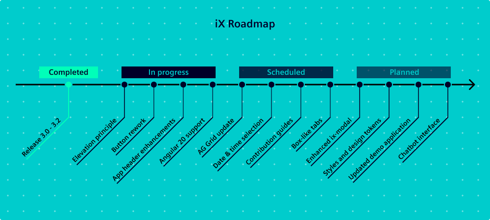
✅ Completed
🔹 Release 3.0: Improving Angular support, global CSS changes, Bootstrap removal, input validation enhancements, date picker enhancements, documentation redesign with versioning. Read more
🔹 Release 3.1: Adding form attribute to the button component, enhancing icon toggle button and fixing bugs.
🔹 Release 3.2: Redesigning time picker and time input, new progress indicator, improving initial render performance, updating the theme generator and enhancing our accessibility guidelines. Read more
🚧 In progress / Currently being worked on
- Elevation principle: Simplifying the elevation system to make it easier to apply and understand visual hierarchy across components.
- Buttons: Reworking our button component with an updated naming convention for clarity, rounded corners for Siemens brand consistency and a new icon-right option for better layout flexibility.
- App header: Enhancing the app header to become more customizable with an additional slot option for custom content.
- Angular 20: Ensuring full compatibility with Angular 20 to stay up-to-date with the latest framework improvements.
🔹 Major release 4.0: Planned for Q3, see info on beta versions and release strategy
🗓️ Scheduled / With tentative timeline
- AG Grid update: Aligning with the latest AG Grid version to ensure seamless integration and improved performance.
- Date-time selection: Applying all enhancements from the date and time components to the combined date-time selection.
- Contribution guidelines: Establishing clearer guidelines for contributing to our design system. This encourages community involvement and ensures contributions are consistent.
- Tabs with containers: Introducing a new, more prominent box-like tab component with a container. It lets designers organize app content more effectively and improve user navigation, e.g. with two levels of tabs.
⏳ Planned / Without specific timeline
- Enhanced ix-modal: Improving our modal component to provide a more flexible and user-friendly experience. This includes better usage together with the ix-toast, more styling options and enhanced functionality.
- Styles and design tokens: Introducing a new design token structure with clearer and consistent naming for colors. Additionally, providing detailed style chapters on animations, borders and typography.
- Updated demo application: Providing an updated demo application showcasing how to effectively utilize the best-of-the-best components. This demo will serve as a practical guide, helping project teams integrate these components seamlessly into their projects.
- Chatbot interface: Developing a chatbot UI to demonstrate how our design system can be used to create interactive and engaging conversational interfaces.
Disclaimer: The roadmap is subject to changes and errors. The information given in this document only contains general descriptions and/or performance features which may not always specifically reflect those described, or which may undergo modification in the course of further development of the products.