Input (text)
Guidelines Development
Guidelines
An input field is a user interface element that allows users to enter and edit text, numbers and symbols. It’s commonly used in forms, search bars, and other areas where data input is required.

- Label
- Required indicator
- Placeholder
- Slot-end
- Slot-start
- Container
- Helper or feedback text
- Counter
Options
- Label: See form field.
- Slot options: Add optional elements at the end and/or start of the input field, e.g. an icon, a button or a text option. We typically use slots for additional indications, options or information like a visibility toggle in a password field.
- Placeholder: Use a placeholder to provide a hint about what to enter or additional relevant context while the input field is empty. We typically use a placeholder when the label is not visible or we need to provide additional context.
- Helper text: See form field.
- Counter: See form field.
- Feedback text: See form field.
Behavior in context
- Validation: See validation.
- Interaction: Clicking in the container enables the editing of the field.
- Text truncation: The text in an input field is cut off with the length of the container.
- Alignment: Inputs are always aligned to the left, while right alignment is reserved exclusively for number fields.
States
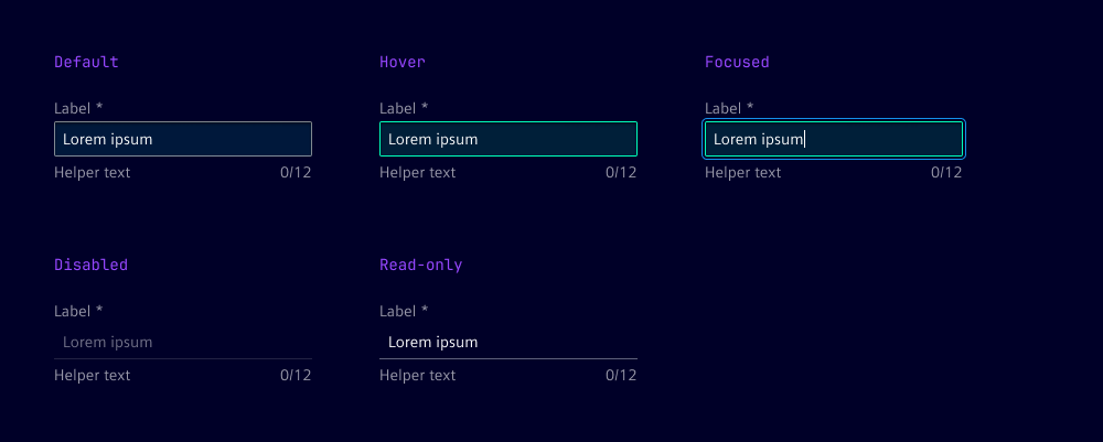
The input field has five states: default, focused, hover, disabled and read-only. In the read-only state, the input field is displayed without offering any user interaction.

Dos and Don’ts
- Do use helper text to guide users through the input process
- Do use feedback text to inform users about the status of their input
- Do ensure that the width of the input field is appropriate for the expected content
- Don’t overcrowd the input field with too many elements
- Don’t use placeholders as a substitute for labels
Related patterns
Development
Examples
Basic
Disabled
Label
Pattern
Readonly
Types
Validation
Slots
API
Properties
Name
Description and specifications
allowedCharactersPattern
The allowed characters pattern for the text field.
Attribute:
allowed-characters-patternType:
string | undefineddisabled
Specifies whether the text field is disabled.
Attribute:
disabledType:
booleanDefault:
falsehelperText
The helper text for the text field.
Attribute:
helper-textType:
string | undefinedinfoText
The info text for the text field.
Attribute:
info-textType:
string | undefinedinvalidText
The error text for the text field.
Attribute:
invalid-textType:
string | undefinedlabel
The label for the text field.
Attribute:
labelType:
string | undefinedmaxLength
The maximum length of the text field.
Attribute:
max-lengthType:
number | undefinedminLength
The minimum length of the text field.
Attribute:
min-lengthType:
number | undefinedname
The name of the text field.
Attribute:
nameType:
string | undefinedpattern
The pattern for the text field.
Attribute:
patternType:
string | undefinedplaceholder
The placeholder text for the text field.
Attribute:
placeholderType:
string | undefinedreadonly
Specifies whether the text field is readonly.
Attribute:
readonlyType:
booleanDefault:
falserequired
Specifies whether the text field is required.
Attribute:
requiredType:
booleanDefault:
falseshowTextAsTooltip
Specifies whether to show the text as a tooltip.
Attribute:
show-text-as-tooltipType:
boolean | undefinedtype
The type of the text field. Possible values are 'text', 'email', or 'password'.
Attribute:
typeType:
"email" | "password" | "tel" | "text" | "url"Default:
'text'validText
The valid text for the text field.
Attribute:
valid-textType:
string | undefinedvalue
The value of the text field.
Attribute:
valueType:
stringDefault:
''warningText
The warning text for the text field.
Attribute:
warning-textType:
string | undefinedEvents
Name
Description and specifications
ixBlur
Event emitted when the text field loses focus.
Detail:
voidvalidityStateChange
Event emitted when the validity state of the text field changes.
Detail:
ValidityStatevalueChange
Event emitted when the value of the text field changes.
Detail:
stringSlots
Name
Description and specifications
end
Element will be displayed at the end of the input
start
Element will be displayed at the start of the input