Input (number)
Guidelines Development
Guidelines
The number input component allows users to enter and adjust numerical values. It’s commonly used in forms, calculators, and other areas where precise numerical input is required. We typically use the number input component to ensure accurate and efficient data entry.

- Label
- Required field indicator
- Value
- Stepper buttons
- Input field
- Helper or feedback text
Options
- Label: See form field.
- Value: See form field.
- Required: See form field.
- Helper text: See form field.
- Feedback text: See form field.
- Show text as tooltip: See form field.
- Placeholder: See form field.
- Allowed characters pattern: Specify the characters allowed for input. We typically use this to reject invalid characters, such as decimal points. When users type an invalid character, a shaking animation is immediately triggered.
- Pattern: Define the expected input using regular expressions, such as an integer between 1 and 100. We often use this to validate the input when the user leaves the field or clicks submit.
- Min/Max: Specify the minimum and maximum values that can be entered to ensure the input stays within the defined range. We typically use this option to prevent invalid entries and guide users towards acceptable values.
- Show stepper buttons: Use these optional controls to increment or decrement the value (suitable for small ranges with few steps). We typically use these buttons when precise adjustments are needed, such as in quantity selectors, rating systems or form inputs requiring fine-tuned numerical values.
Behavior in context
- Interaction: Users can type a value or use stepper buttons to adjust it. We recommend using stepper buttons, especially for touch interactions, to enhance usability and precision.
- Validation: See form field.
- Overflow: Numbers are truncated to fit within the input field. Ensure that the expected value is visible in the input field so it can be properly displayed.
- Alignment: Number inputs are always aligned to the right.
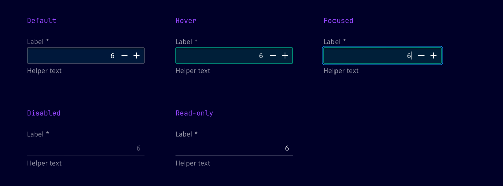
States
The number input has five states: default, hover, focused, disabled and read-only.
Dos and Don’ts
- Do set appropriate min and max values to prevent invalid entries and guide user input
- Do provide clear error messages when the input value is out of the allowed range or does not match the required pattern
- Do consider special cases such as zero, negative numbers and very large numbers to ensure all possible inputs are handled correctly
- Don't specify patterns that do not align with your use case, e.g. inappropriate intervals between valid values
Related patterns
Development
Examples
Basic
Disabled
Label
Readonly
Stepper buttons
Validation
Slots
API
Properties
Name
Description and specifications
allowedCharactersPattern
The allowed characters pattern for the input field
Attribute:
allowed-characters-patternType:
string | undefineddisabled
Disables the input field
Attribute:
disabledType:
booleanDefault:
falsehelperText
The helper text for the input field
Attribute:
helper-textType:
string | undefinedinfoText
The info text for the input field
Attribute:
info-textType:
string | undefinedinvalidText
The error text for the input field
Attribute:
invalid-textType:
string | undefinedlabel
The label for the input field
Attribute:
labelType:
string | undefinedmax
The maximum value for the input field
Attribute:
maxType:
number | string | undefinedmin
The minimum value for the input field
Attribute:
minType:
number | string | undefinedname
name of the input element
Attribute:
nameType:
string | undefinedpattern
The pattern for the input field
Attribute:
patternType:
string | undefinedplaceholder
placeholder of the input element
Attribute:
placeholderType:
string | undefinedreadonly
Indicates if the field is read-only
Attribute:
readonlyType:
booleanDefault:
falserequired
Indicates if the field is required
Attribute:
requiredType:
booleanDefault:
falseshowStepperButtons
Indicates if the stepper buttons should be shown
Attribute:
show-stepper-buttonsType:
boolean | undefinedshowTextAsTooltip
Indicates if the text should be shown as a tooltip
Attribute:
show-text-as-tooltipType:
boolean | undefinedvalidText
The valid text for the input field
Attribute:
valid-textType:
string | undefinedvalue
The value of the input field
Attribute:
valueType:
numberDefault:
0warningText
The warning text for the input field
Attribute:
warning-textType:
string | undefinedEvents
Name
Description and specifications
ixBlur
Event emitted when the input field loses focus
Detail:
voidvalidityStateChange
Event emitted when the validity state of the input field changes
Detail:
ValidityStatevalueChange
Event emitted when the value of the input field changes
Detail:
numberSlots
Name
Description and specifications
end
Element will be displayed at the end of the input
start
Element will be displayed at the start of the input