Input (date)
Guidelines Development
Guidelines
The date input component enables users to enter and select a date in a standardized format. We typically use this component in forms, filters and scheduling tools to ensure consistent and accurate date entries.

- Label
- Required field indicator
- Current value
- Calendar icon button
- Input field
- Date dropdown
- Month and year selection
- Weekdays
- Week numbers
- Indicator for current day
- Indicator for selected day
Options
- Label: See form field.
- Required: See form field.
- Helper text: See form field.
- Feedback text: See form field.
- Show text as tooltip: See form field.
- Placeholder: See form field. We typically use a placeholder to show an example date format to assist users when the field is empty.
- Error message: Feedback text when date is not parsable. We typically use this to inform users that the entered date format is incorrect and guide them to enter a valid date.
- Format: Specify the date format, default ‘yyyy/LL/dd’ to ensure that dates are entered in a consistent and recognizable format.
Behavior in context
- Interaction:
- Click or focus opens the date picker.
- Use mouse or keyboard arrows to navigate to the desired date.
- Selecting a date in date picker with mouse click or enter closes the date picker.
- Typing a date into input field with valid format closes the date picker.
- Escape key closes the date picker.
- Validation:
- Use feedback text for validation types valid, info, warning and invalid.
- Invalid feedback automatically provided if entered date in not parsable.
- Refer to the validation chapter for detailed guidelines.
- Overflow: The input field should be wide enough to display the full date without truncation.
- Alignment: Date inputs are always aligned to the left.
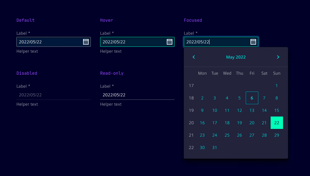
States
Date input has five states: Default, hover, disabled, read-only and focused.
Dos and Don’ts
- Do use consistent date formats throughout the application to avoid confusion
- Do use separate inputs for start and end dates to simplify date ranges
- Do provide clear instructions, such as “Enter the date in yyyy/mm/dd format”
- Do consider localization to adapt date formats to local conventions
- Don't use ambiguous formats like 09/08/2006 without giving clear context
- Don't allow free text without validation or formatting guidance
Related patterns
Development
Examples
Basic
Disabled
Label
Readonly
Validation
Slots
API
Properties
Name
Description and specifications
disabled
disabled attribute
Attribute:
disabledType:
booleanDefault:
falseformat
Date format string.
See {@link "https://moment.github.io/luxon/#/formatting?id=table-of-tokens"} for all available tokens.
Attribute:
formatType:
stringDefault:
'yyyy/LL/dd'helperText
helper text below the input field
Attribute:
helper-textType:
string | undefinedi18nErrorDateUnparsable
i18n string for the error message when the date is not parsable
Attribute:
i18n-error-date-unparsableType:
stringDefault:
'Date is not valid'infoText
info text below the input field
Attribute:
info-textType:
string | undefinedinvalidText
error text below the input field
Attribute:
invalid-textType:
string | undefinedlabel
label of the input field
Attribute:
labelType:
string | undefinedlocale
Since 2.6.0
Locale identifier (e.g. 'en' or 'de').
Attribute:
localeType:
string | undefinedname
name of the input element
Attribute:
nameType:
string | undefinedplaceholder
placeholder of the input element
Attribute:
placeholderType:
string | undefinedreadonly
readonly attribute
Attribute:
readonlyType:
booleanDefault:
falserequired
required attribute
Attribute:
requiredType:
boolean | undefinedshowTextAsTooltip
show text as tooltip
Attribute:
show-text-as-tooltipType:
boolean | undefinedvalidText
valid text below the input field
Attribute:
valid-textType:
string | undefinedvalue
value of the input element
Attribute:
valueType:
stringDefault:
''warningText
warning text below the input field
Attribute:
warning-textType:
string | undefinedEvents
Name
Description and specifications
validityStateChange
Validation state change event.
Detail:
{ patternMismatch: boolean; invalidReason?: string | undefined; }valueChange
Input change event.
Detail:
stringSlots
Name
Description and specifications
end
Element will be displayed at the end of the input
start
Element will be displayed at the start of the input